<script>
if( /Android|webOS|iPhone|iPad|iPod|BlackBerry|IEMobile|Opera Mini/i.test(navigator.userAgent) ) {
    var window_width = $(window).width();
    if(window_width <= 991){
        console.log("Mobile Devices width is smaller than 991");
        var windowHeight = $(window).height(),
            gridTop = windowHeight * .3,
            gridBottom = windowHeight * .8;

        $(window).scroll(function(){
            $.each($("[class$=area]"),function(){
                var thisTop = $(this).offset().top - $(window).scrollTop();

                if (thisTop > gridTop && (thisTop + $(this).height()) < gridBottom) {
                    if($(this).css("bottom") != "0px"){
                        $(this).css("bottom", "0px");
                    }
                } else {
                    if($(this).css("bottom") == "0px"){
                        $(this).css("bottom", "-105px");
                    }
                }
            });
        });
    }
}
</script>
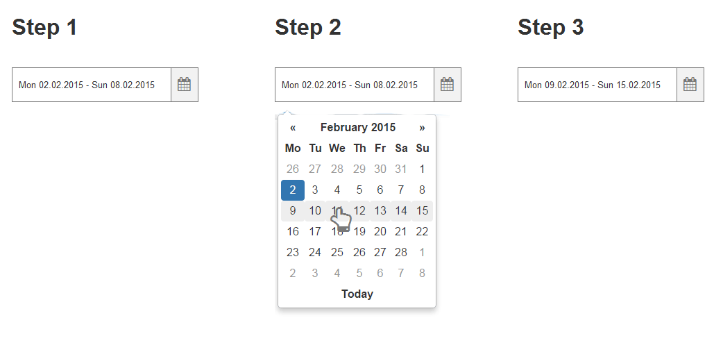
REF : https://jsfiddle.net/atcwL1mz/